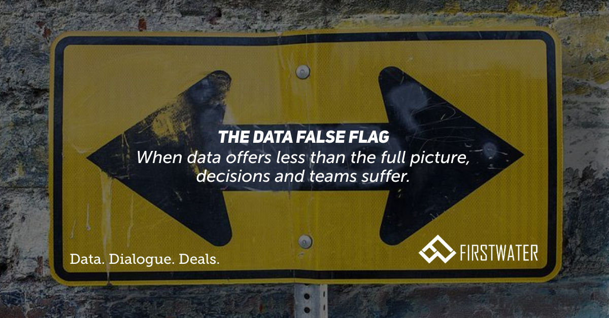
Data and analytics are valuable to business management. That isn’t news. However, there are many situations where improper labeling, incomplete datasets, or insufficient granularity can actually be worse than having no data at all. When suboptimal data feeds directly into decision processes, we consider this information a “false flag” as decision makers often assume the data is comprehensive or can be readily extrapolated to the full picture. Here are a couple examples where the false flag can cause pain, and ways to avoid the trap.
Potato, Puh-Tot-Oh (the Single Source of Truth)
Sales are sales, right? We worked with a manufacturing company where each division (sales and marketing, labor and production, customer service, etc.) had metrics that benchmarked performance against “sales.” That’s fine, but when we started meeting with the teams, we discovered that everyone had a different definition of sales.
There were good reasons for this. Sales measured “gross sales” as they shouldn’t be penalized for returns associated with defective products. Production analyzed “sales net of returns for defects” to get at adjusted efficiency metrics. Marketing utilized “sales net of all returns” to measure the long-term ROI of their promotional programs (e.g. a direct mattress company offering a 100-night trial period).
There were no fewer than five different sales numbers being thrown about, which created a reporting and presentation nightmare as data users throughout the organization would grab what they thought was “sales.” The resulting KPIs that flowed up to management had become polluted due to a lack of a “single source of truth,” resulting in confusion and a loss of confidence in the reporting process.
In this case, the issues were data access control and mislabeling. We were able to formalize all of the various definitions with the corresponding bridge to gross sales, and build out clearly labeled calculated measures to leave no doubt that a data user had the sales numbers they wanted and needed.
Peel the Onion to Avoid Tears
Sticking with sales, we’ll move from having too much data (or too many definitions) to the downsides of not having enough. When data is available, but not to the needed level of granularity, conclusions can be drawn that lead to critical mistakes.
Consider a software business with customers on annual contracts. The business has two salespeople, Jack and Mack, each with similarly-sized books of business and growth targets. Their compensation is simple – they receive a percentage of the total revenue generated from their books.
Jack has a large account that recently acquired a competitor, doubling the size of the account. This jump alone exceeds Jack’s growth target for the year, so he enters coast mode and takes it easy. At the end of the year, he gets his commission check, a stretch bonus, and a pat on the back for his growth.
Mack, on the other hand, has some accounts that have had problems due to the development team not addressing feature concerns promptly. These accounts cancel, and Mack goes into aggressive hunt mode. He replaces the lost accounts with new ones that are higher-margin, but falls short of his overall revenue growth target. There’s no stretch bonus for Mack, and worse, he is told that his position is under review.
Although a simplistic example, this one shows how not capturing and leveraging data beyond the first layer (total revenue by salesperson) can yield conclusions counter to reality. Lack of granularity can also lead to incentive structuring that rewards bad behavior while failing to identify desired behavior – a double whammy.
Here, capturing organic vs. inorganic growth within existing accounts, customer churn (and reasons for churn), and new relationships added (“new logos” in sales parlance) would have shown Mack to be the better salesperson. Further, if this data existed, the compensation structures could have been designed to more appropriately reflect the items within each salesperson’s control.
Quality Over Quantity, but Utility Over All
We all know the maxim. Quality beats quantity, at least in most things. However, when it comes to data, utility is the preferred metric. While one could say that the ability to utilize information is what defines quality, it is important to note the completeness and richness of data itself is separate from the process and manner in which it is synthesized and digested. The ongoing challenge is to thread the needle between investing in data capture, quality control, and reporting processes to get the right data into the right hands for the right dialogues. Confident decisions, and Mack’s well-being, depend on it!
Check out our whitepaper, Unleashing FP&A, to see how you can activate and amplify financial planning and analysis capabilities (data analysis, reporting/BI, forecasting, scenario analysis) without the big teams and big budgets of large corporations.